Short answer: the seven commonly cited types of logos are the wordmark, lettermark, pictorial mark, abstract mark, mascot, combination mark and emblem. The right one depends on the length of your business name and where the logo has to work, especially at favicon size, where most wide logos need a separate square version.
Last updated September 16, 2026. The search figures in this guide were pulled that day, and brands are named as text examples only.
Most talk about logo styles starts with taste. Start with use instead: the same logo has to fill a wide header on each of the five pages a small business website needs and a tiny square in a browser tab.
What are the main types of logos?
The main types of logos fall into three families. Two use only letters, three lead with a symbol, and two combine letters with a shape.
| Type | What it is | Works best when | Risk at small size |
|---|---|---|---|
| Wordmark | The business name alone, in a distinctive typeface | The name is short and distinctive | High for long names: the letters turn thin |
| Lettermark | Initials or a short abbreviation | The full name is long or hard to say | Low, if the letters stay simple and bold |
| Pictorial mark | A recognizable image of a real thing | The image says something true about the business | Low for simple shapes, high for detailed drawings |
| Abstract mark | A geometric form with no literal meaning | You want a symbol you can own and build meaning into | Low for bold shapes, high for fine lines |
| Mascot | An illustrated character | The brand speaks in a friendly, character-led voice | High: faces and fine detail blur first |
| Combination mark | The name and a symbol, designed to work together or apart | You need both a wide and a square version | High for the full version; use the symbol alone |
| Emblem | Text set inside a badge, crest or seal | You want a traditional, established look | High: the text inside the badge fills in |
The last column is a rule of thumb based on how each type is built, not a measured result.
What are wordmark and lettermark logos?
A wordmark logo is the business name on its own, set in a distinctive typeface or custom lettering. For example, Coca-Cola’s flowing script is a well-known wordmark. Because the name is the logo, a wordmark teaches people what you are called from the first look.
A lettermark logo, also known as a monogram, uses initials or a short abbreviation instead of the full name. IBM, for instance, is a familiar example. It suits a business with a long or hard-to-say name, since three bold letters fit where fifteen will not.
However, both types depend entirely on the letters. Spacing, weight and letter shapes carry all of the personality. That is why an off-the-shelf font rarely makes a memorable wordmark.
How do pictorial, abstract and mascot logos differ?
These three types lead with a symbol rather than the name.
- Pictorial mark. A recognizable image of a real thing, such as an object, an animal or a plant. The Apple logo, an apple with a bite taken out, is a familiar example. The picture can hint at what you do. Be careful, though: a very literal image can box you in as the business grows.
- Abstract mark. A geometric form that does not depict anything real, such as the Nike swoosh. Because the shape has no built-in meaning, you give it one through consistent use over time.
- Mascot. An illustrated character that stands for the brand, such as Colonel Sanders for KFC. A mascot gives a business a face and a voice, which works well on packaging, signs and social media. Since a character takes more drawing than a set of letters, the choice can also shape what logo design costs in New York.
Still, a symbol on its own only works once people connect it with your name. That is why many brands pair the symbol with the name for a long time before using it alone.
What are combination mark and emblem logos?
A combination mark logo joins the name and a symbol in one design, while each part can also stand alone. The Puma name with its leaping cat is a familiar example. It is often the most flexible type. The full version fills a wide header, and the symbol alone fits a square.
For that reason, our brand identity work delivers both the wordmark and the mark, in every format you need, including editable vector originals. A written guideline document then fixes the minimum size and clear space, and shows how the mark behaves in one color, on a dark background and on a photograph. Our brand page covers the guideline system that keeps a wordmark and mark consistent.
An emblem logo sets the text inside a shape, such as a badge, crest or seal. The Harley-Davidson bar and shield is a well-known example. Emblems look established and suit uniforms, vehicles and signs. On the other hand, you cannot pull the name out of the shape. At small sizes, the text inside the badge blurs first.
Which types of logos stay readable at favicon size?
A favicon is the small icon in a browser tab and next to your site in search results. Google’s favicon guidelines for Search require a square of at least 8×8 pixels and recommend going larger than 48×48 pixels. The icon should also visually represent your brand.
That square is where most types of logos run into trouble. Do the math. A ten-letter name across a 48-pixel square gets less than 5 pixels of width per letter. In other words, a wide logo needs a square version. Going by how each type is built, the seven sort roughly into three groups:
- Usually fine as they are. Lettermarks, simple pictorial marks and bold abstract marks, because each one is a single compact shape.
- Need a small-size version. Wordmarks, which often shrink to a first letter, and combination marks, which drop the name and keep the symbol.
- Need the most redrawing. Mascots and emblems, since faces, fine lines and text inside a badge disappear first. A simplified head, or the badge with one initial inside, often reads better.
The same square version also becomes your social profile image, while a storefront sign usually carries the wide version. Likewise, a website built to your brand guidelines uses both, with the wide version in the header and the square one in the browser tab.
So check your own logo in the places it will live. View it at browser-tab size, in a phone-screen header, in one color, on a dark background and on a photograph. Then look at the sign as well, because it shows up again in the storefront photos that our field-by-field Google Business Profile guide tells you to add. If the logo only reads large and on white, it is not finished yet, whatever type it is.
How should a small business choose between types of logos?
First, set popularity aside. We pulled US keyword data from DataWise SEO on September 16, 2026, using 12-month averages. Searches for wordmark logo came to 2,900 a month. Emblem logo, abstract logo and mascot logo each averaged 1,900. Lettermark logo followed at 1,000, combination mark logo at 590 and pictorial mark logo at 260.
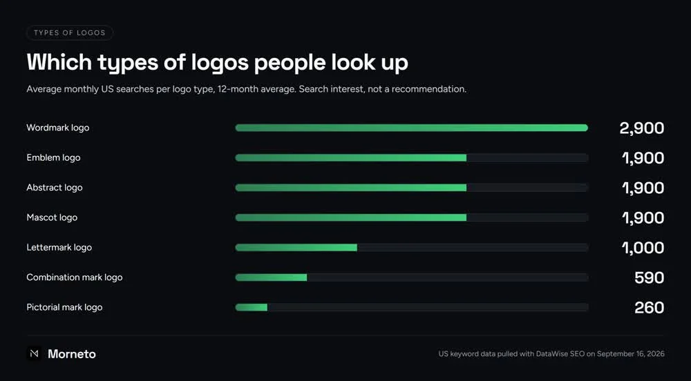
Those numbers show what people want explained, not which type fits a business. Instead, answer four questions:
- How long is the name? A short, distinctive name favors a wordmark, while a long or awkward one favors a lettermark or a combination mark.
- Do people know you yet? A new business usually needs the name in the logo. A symbol alone means little until people have seen it beside the name.
- Where will it live? If a favicon, a social profile or a storefront sign matters, plan both versions from the start, which is where our logo design work for New York City businesses begins, and scope them alongside the website rather than after it.
- Do you already have a logo? Recognition builds slowly, and a brand-new mark starts that clock again. If people already know yours, our usual advice is to keep it and refresh the type, color and spacing around it, which costs less than starting over. To find out which applies, you can show us the logo you use now, and you keep the assessment either way.
Whichever type you choose, write down where the logo has to work before anyone starts drawing. If you plan to hand the choice to a studio, bring the questions to ask a design agency before you sign to the first meeting.
Common questions about types of logos
How many types of logos are there?
Many design guides list seven: wordmark, lettermark, pictorial mark, abstract mark, mascot, combination mark and emblem. Some merge similar types into fewer groups, so the count depends on the guide, but the seven-type list is a common starting point.
Is a wordmark or a symbol better for a new business?
Usually one that includes the name. A symbol on its own means little until people have seen it next to the name. A combination mark gives you both: the name builds recognition, and the symbol covers square spaces.
Can one business use more than one type of logo?
Yes. One practical setup puts the full combination mark in the website header. The symbol or an initial then serves as the favicon and social profile image. Keep the colors and shapes the same across versions, and write down which version goes where.
Which logo type works best as a favicon?
Usually a lettermark, a simple pictorial mark or a bold abstract mark, because each one is a single compact shape. For Google Search, a favicon must be square and at least 8 by 8 pixels, and Google recommends going larger than 48 by 48 pixels.
What is the difference between a logo and a brand identity?
A logo is the mark itself. A brand identity is the system around it. That covers color, type, spacing and the rules for applying them to a website, social profiles and print.